Three Award-Winning Trade Show Displays: What made them appealing?
It’s amazing to think about just how many trade show displays get exhibited in a given year. In recent years, literally millions of trade show displays go up, and every one of them is trying desperately to get noticed and stand out from the competition.
So, let’s take a look back. Out of those millions of exposition booths put up last year, which were the best? And why? There are plenty of design magazines picking their favorites, so let’s do a bit of curation and talk about WHY we think some of these were so great.
Looking At The Best Of 2012’s Trade Show Displays
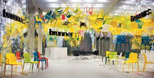
Let’s start with one that’s truly awe inspiring. Take a look at this amazing, surreal, painterly exposition display from Brunner GmbH, selected by Exhibitor Magazine as a 2012 winner. Besides the sheer wow factor, what’s great about it?
- Plenty of open space. The decision to put so much above the show floor meant more walking room.
- The chair arrangement allowed people to look at them from practically any angle.
- The overall light colors of the display allow the dark-gray Brunner logo to really stand out.
Really, in terms of composition, creative use of space, and crafting a visual that will stick in the head of everyone who wandered by, this may be among the best trade show displays I’ve ever seen. Some who prefer a more minimalist aesthetic might quibble on artistic grounds, but in terms of audience impact, it just doesn’t get much better than this.
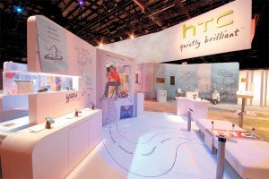
Continuing with a general theme of fun and whimsy (mostly because I think that’s a better way to get people’s attention than being Mr. Serious), take a look at this wonderfully mixed-media trade show display from HTC. Everyone wants to make their new electronic gadgets look sim ultaneously fun, futuristic, and yet grounded in reality. HTC really pulled it off.
Notice:
- Again, loads of walk-around space. The lack of hard wall enclosures make it feel even more open and inviting.
- The way the physical and drawn elements flow into each other (did you notice the moped in the back?) drives home the idea of how their products can impact reality.
- Elements like the large paperclip show they were really carrying through their concept.
- The logo, again, is in a different color that stands out, making it “pop.”
This is a display that makes me want to walk through my monitor and have a chance to look at it in person. I wish I could see more detail work than these pics allow, and that says something.
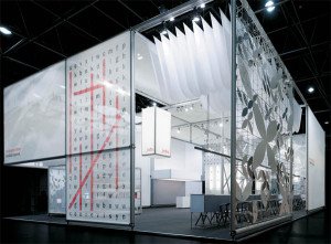
On the other hand, if you want something slightly more minimalistic, that still doesn’t stop you from having fun and playing with space. Check out this almost entirely black and white trade show display from Burkhardt Leitner.
It just looks like something you’d want to honestly spend time exploring.
- Did you catch the word-find puzzle on one of the corners?
- The talking plants the article refers to are a great way to surprise visitors and hit them with a message in an unexpected way.
- The contrast between the nearly-monochromatic layout and the whimsical content shows that Burkhardt Leitner can bring “color” to anything – as evidenced by them putting their own name in red.
- Yet, despite all the random distractions, there’s still clearly a “quieter” area inside the exhibit for people to talk.
While most of you won’t have the budget to do trade show displays on this scale, at least not yet, hopefully they’ve gotten you thinking. Colors, arrangements, and even creative use of 3D space can all augment your message, and help you craft more powerful trade show displays.
