Exhibiting 101: How To Design Great Trade Show Booth Graphics
This is the fourth in a series of articles about the basics of exhibiting that began with the first post of the New Year.
We’ve all heard it so many times, it’s become a cliché: “You only have three (or five or seven) seconds to make a good first impression with your trade show booth graphics.”
Different sources quote different lengths of time, but the point is clear: your trade show graphics are fighting an uphill battle to get attention on the show floor, and get the right kind of attention for you.
You’ve undoubtedly seen examples of epic fails in some exhibitors’ graphics, with signs that look like shopping lists, adorned with a rainbow assortment of colors and typefaces that jars the eyes. That gets attention, but for all the wrong reasons.
Your trade show graphics should be the introduction your exhibit makes to each attendee that walks by, ideally helping to separate interested prospects from a bunch of tire kickers who haven’t figured out what you do.
How do you make your booth’s graphics work for you? There are a number of best practices that can steer you in the right direction when you’re planning your exhibit’s graphics. Here’s what our experience has taught us:
Designing Trade Show Booth Graphics
1. Tell them who you are
More than anything else, your exhibit’s graphics should make it clear to attendees who your company is. If you are fortunate enough to have a well-known acronym or logo (think IBM or Apple), it can stand on its own.
If you’re not in that rarified group, your trade show booth graphics should include your company name, as well as your logo.
2. Tell them what you do
This is where a Unique Selling Proposition (USP) or a tagline can help communicate that your product or service is different from—and better than—the competition’s. This can be a one-word statement or a short sentence that encapsulates your position in the marketplace.
City National Bank’s logo is a ladder, and their USP is “The Way Up.” This suggests to both businesses and individual customers that City National wants to help its customers grow their enterprises or personal wealth.
3. Tell them what’s in it for them
Prospects don’t want to know that your widgets are stronger, cheaper or delivered faster than your competition’s widgets. Prospects want to know what those features and benefits mean to them.
Stronger widgets mean fewer breakdowns, increasing uptime by as much as 47%. Cheaper widgets mean your customers can price their products more competitively. You get the idea.
4. Remember, less is more
Product literature or your website can tell the whole company story. Your trade show booth graphics have one simple job to do: attract attention and increase interest among attendees.
To do this, you have to be sparing with your text. Think of a billboard instead of a brochure. White space is your friend.
5. Present your graphics the way people read them
Attendees are going to take in your trade show booth graphics the way they read a book or newspaper: left to right and top to bottom. Getting “cute” with the way your graphics are arranged may do more harm than good.
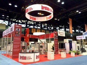
Also, make sure that it’s visible from a distance. That means the text size should be large enough, but the graphics should also be displayed higher in your exhibit.
Positioning your graphics so they’re a foot off the floor may seem like a good design decision, but people standing in front of your exhibit will block everyone else’s view.
6. Stay consistent
The graphics in your booth should harmonize with graphics you use elsewhere, such as in your product literature. Too many different messages create confusion in your visitors’ minds. Your booth will be more memorable and effective if you tell one story well.

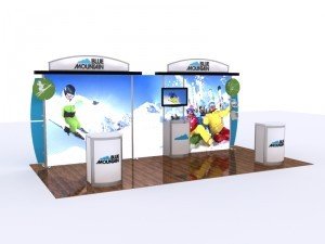
Custom Island Rental Display with consistently themed and coordinated graphics
7. Use photographs and illustrations sparingly
Using a photo or image as the background for your graphics may appeal to a designer, but it’s going to make it harder for your prospects to read. Use only high quality, high resolution images. Blowing up a small (or low resolution) picture makes the larger version look grainy or pixelated.
8. Consider how your trade show booth graphics will be lit
Are you relying on ambient light to illuminate your trade show graphics, or are you using backlighted panels, backlit fabric banners or other lighting options to make them “pop”? If you’re planning to hang your company’s logo above your exhibit, are there spotlights directed toward it to make it look good?
In any environment, lighting helps set a mood, so don’t let it be an afterthought.
9. Incorporate motion or other technology
Movement draws attention, and that’s a desirable thing with your trade show booth graphics. Consider adding an electric motor to the rigging of your hanging logo or hanging banners. Use flat-panel monitors instead of light boxes so your trade show graphics can move or change.
New technology is entering the exhibit field constantly, so ask your exhibit supplier if there are new ways to give your graphics an edge.
10. Don’t be afraid of change
Trade show booth graphics aren’t meant to last forever. In most cases, they’re usually replaced with new designs every few shows or so.
It’s the most cost-effective way to change the look of your exhibit, so do it often—especially before going back to the same show a second time. You want to avoid using the same graphics so often that show attendees write you off as having nothing new for them to see.
For additional discussion on designing great trade show graphics, see Trade Show Graphics – You have 3 Quick Seconds to be Victorious.
At American Image Displays, our graphics specialists have years of experience creating effective graphics and signage for our customers. If your current designer isn’t giving you what you want, we’d welcome the opportunity to show you what we can do. We also represent more than a dozen modular exhibit manufacturers, so we can create exciting and attractive exhibits of any size. For more information, call (800) 676-3976 or email [email protected].
See full list of Exhibiting 101 articles here.

