
How to Use Psychology in Booth Layout Design
Psychology can transform your trade show booth into a magnet for visitors. Here’s how:
- First Impressions Are Key: Visitors decide to engage in less than 5 seconds, forming opinions in just 7 seconds. Open, organized, and visually appealing booths win attention fast.
- Leverage Movement Patterns: People scan spaces in "Z" or "F" patterns. Place key visuals and messages where their eyes naturally land.
- Create Zones: Booths with defined areas for interaction, demos, and conversations can boost engagement by 40%.
- Multi-Sensory Design: Engaging 3+ senses (e.g., touch, sound, scent) can increase brand connection by 70%.
- Color Psychology: Use colors strategically to evoke emotions – blue builds trust, red grabs attention, and green promotes calmness.
- Traffic Flow Matters: Open layouts with wide paths encourage exploration. Avoid clutter and ensure clear sightlines.
- Lighting and Visual Priority: Highlight key messages with layered lighting and bold graphics to guide attention.
- Digital Displays: Dynamic content on screens enhances engagement and visibility.
Booth Design Ideas That Win On The Trade Show Floor
How Visitors Behave at Trade Shows
Understanding how attendees move and make decisions at trade shows can give you a serious edge when designing your booth. People don’t just wander aimlessly – they follow predictable patterns, and savvy exhibitors can use this to their advantage.
Common Movement Patterns
Trade show attendees tend to stick to the main aisles, naturally gravitating toward open and visually engaging spaces. They move quickly, scanning exhibits as they follow the flow of foot traffic.
When deciding where to stop, visitors are drawn to booths with open, inviting entrances rather than cramped or maze-like setups. The fast-paced nature of trade shows means simplicity is key – attendees are more likely to engage with booths that are easy to access and visually appealing.
To capitalize on these tendencies, position key displays along main traffic routes, ensuring they’re immediately noticeable. Avoid cluttered layouts, as they can subconsciously discourage visitors from entering your space. First impressions happen in an instant, so your booth needs to make its mark right away.
First Impressions Matter Most
The first few seconds a visitor spends looking at your booth are critical. Research shows that people form decisions almost instantly when encountering something new. This means your booth must immediately project professionalism, relevance, and value.
"Multi-sensory experiences create stronger emotional connections and enhance recall." – Dr. Peter Steidl, Leading Consumer Psychologist
Booths located near entrances have an advantage because they attract visitors who are still fresh and open to new information. A polished, well-organized booth sends a clear message about your company’s competence, building trust with potential clients right from the start. Every detail matters – from your graphics and lighting to how your staff is positioned. That initial emotional response is powerful and hard to change once it’s made. This is why creating a visually cohesive and inviting presentation is so important.
Visitors Choose the Easy Path
When navigating a trade show, attendees naturally opt for the simplest route. Booths positioned along natural traffic flows – like main aisles or intersections – are more likely to draw attention than those tucked into isolated corners. Open layouts with clear, accessible entry points invite visitors to stop and explore, while closed-off or cluttered designs create subtle barriers that can discourage engagement.
Prime locations, such as intersections or areas near food courts, naturally attract higher foot traffic. However, even less prominent spots can be optimized. Clear sight lines and the removal of physical obstructions can make your booth more inviting. Inside the booth, create pathways that guide visitors to key areas of interest. Place reception counters and staff stations where they’re easy to find and approach. By designing for ease and accessibility, you can significantly boost engagement, no matter where your booth is located.
Visual Design and Space Planning
Visual design isn’t just about making your booth look good – it’s about creating a space that naturally guides visitors where you want them to go. By understanding how people process visual information, you can design a layout that feels intuitive, inviting, and easy to navigate.
Creating Visual Priority
To grab attention, establish a clear visual hierarchy using size, contrast, and placement. Place your most important message or product in a spot that’s impossible to miss. This focal point should be the first thing visitors notice when they approach your booth.
Use high-contrast colors and bold, legible fonts that can be read from 20 feet away. Why? Because attendees often decide whether to visit your booth long before they’re close enough to read smaller details. Combine striking graphics with plenty of white space to avoid visual clutter and ensure your key message stands out.
Lighting also plays a big role in creating visual priority. Layered lighting at varying heights adds depth, highlights key areas, and naturally draws people toward illuminated spots. Accent lights on products or backlit graphics make your messaging pop, even in a crowded, busy exhibition hall. These elements work together to guide attention and set the stage for a seamless visitor experience.
Guiding Movement with Design Elements
Once you’ve established your visual hierarchy, use design elements to guide how visitors move through your space. Thoughtful details like lighting and floor graphics can subtly direct traffic without feeling intrusive.
Floor graphics or changes in texture create natural pathways that encourage visitors to explore your booth while still giving them a sense of freedom and control. These subtle cues help visitors move through the space in a way that feels organic.
"It is also important that a change in texture or brightness in the visual array is associated with something important going on in the scene. In other words, something that draws one’s attention within the scene should turn out to be an important object or boundary… If what draws one’s attention and what is worth looking at turn out to be different properties, then the scene lacks coherence."
- Rachel and Stephen Kaplan, University of Michigan psychology professors
Signage placement is another key factor. Position your signs along natural sight lines, ensuring visitors see your key messages as they move through the booth. Every design choice should build on the last, guiding visitors step by step through their journey.
Keep Layouts Simple and Clear
A clean, simple layout is essential for creating a space that feels welcoming and easy to navigate. Aim for 60% open space with pathways that are 4–6 feet wide. This keeps the booth from feeling cramped and allows visitors to move comfortably.
"Effective booth traffic flow ensures attendees encounter your messaging, products, and staff in a logical, inviting order."
Vertical design elements can also help. By incorporating height, you make your booth more visible from a distance while freeing up floor space for visitors. Use tall structures sparingly to maintain sight lines to your key areas.
Hidden storage is another pro tip. Tuck away brochures, samples, and other materials to keep the booth looking clean and professional. A tidy, clutter-free space projects confidence and makes a stronger impression on visitors.
Finally, make sure exits are easy to spot. When visitors can see a clear way out, they feel more comfortable staying longer to explore what you have to offer. This small detail can make a big difference in how people experience your booth.
Color Psychology and Emotional Response
Understanding how different colors influence emotions can help you design a space that connects with your audience and motivates the actions you want them to take.
How Colors Affect Emotions
Colors communicate on a subconscious level, shaping how visitors perceive your space. In fact, research shows that 90% of first impressions are based on color. The right color choices can make a lasting impact before a single word is spoken.
"Color plays a powerful role in human perception. It influences emotion, triggers memory, and sways decision-making often before a single word is spoken or read."
Each color carries its own emotional weight:
- Blue fosters trust and credibility, making it ideal for industries like finance, healthcare, and technology.
- Red conveys energy and urgency but should be used sparingly to avoid overwhelming visitors.
- Green promotes calm and symbolizes growth, making it a great fit for eco-friendly, health, or wellness brands.
- Yellow accents add a touch of friendliness and optimism.
- Orange brings dynamic energy and enthusiasm, perfect for energizing specific areas.
- White offers clarity and sophistication, while black, when used thoughtfully, adds elegance without feeling heavy.
| Color | Emotional Impact | Best Used For |
|---|---|---|
| Blue | Trust, credibility, calm | Finance, healthcare, technology |
| Red | Energy, urgency, excitement | Call-to-actions, highlighting key areas |
| Green | Growth, health, calm | Eco-friendly brands, wellness products |
| Yellow | Friendliness, optimism | Creating a welcoming atmosphere |
| Orange | Energy, enthusiasm | Energizing booth areas |
| White | Clean, sophisticated, minimal | Product showcases, modern brands |
To design a balanced and visually appealing space, try the 60-30-10 rule: use 60% of a dominant color, 30% of a secondary color, and 10% as an accent. This approach prevents visual clutter while maintaining harmony. Also, keep your booth colors aligned with your overall branding – consistent branding across all touchpoints has been linked to a 23% increase in revenue.
Color psychology doesn’t just guide attention; it shapes emotions and influences behavior. Pair your color strategy with thoughtful lighting and tactile features to fully engage visitors.
Lighting and Touch Elements
While color sets the tone, sensory elements like lighting and texture take the experience to the next level. Lighting, for instance, affects how colors are perceived. Warm lighting creates a cozy, inviting feel, while cooler lighting gives off a sleek, modern vibe. Spotlights can draw attention to key products or messages, making them stand out. When combined with your color palette, strategic lighting creates an immersive environment that holds visitors’ attention.
Interactive features like touchscreens or product stations encourage deeper engagement. Adding tactile components – such as textured flooring or comfortable seating – enhances the visitor experience. You can also use sound and lighting to reflect your brand’s personality, whether that’s high-energy or calm and refined. Always test color combinations under the actual lighting conditions before finalizing your design.
sbb-itb-d6c8c47
Booth Layout for Better Traffic Flow
Once you’ve nailed down your color scheme and lighting, it’s time to focus on your booth’s layout. A well-thought-out design doesn’t just look good – it influences how visitors move through your space, how long they stay, and how much they engage with your brand. Let’s dive into some practical layout strategies to make the most of your booth.
Design Open Entry Points
The entrance to your booth is like a first handshake – it sets the tone for everything that follows. If your entry feels blocked or unwelcoming, visitors might hesitate to step inside. To avoid this, keep the entrance wide and inviting.
Position eye-catching displays near the entrance, but don’t overcrowd the area. You want to spark curiosity without making it feel chaotic. Station your team at key entry points to greet attendees and guide them naturally through the space. Their friendly presence can make a big difference in creating a welcoming vibe.
Wide pathways and clear sightlines also play a big role here. An open, accessible layout makes your booth feel approachable, drawing people in rather than overwhelming them.
Organize Your Booth by Activity
Think of your booth as a mini-map of experiences. By creating distinct zones for different activities, you make it easier for visitors to navigate and engage with your space. For example, designate specific areas for product demos, one-on-one conversations, and interactive displays. This setup allows attendees to explore based on their interests.
Interactive elements like touchscreens or digital presentations work best in high-traffic spots. Place them where they’ll grab attention but won’t disrupt the natural flow of movement.
Your visuals can also guide visitors through the space. Use graphics that unfold your brand’s story step by step, leading people from casual interest to deeper engagement. And don’t forget about incentives! Spread giveaways or promotional items throughout the booth instead of clustering them at the entrance. This tactic encourages visitors to explore more areas and keeps the energy flowing.
Plan Comfortable Walking Paths
The pathways in your booth should feel as intuitive as walking through a well-designed store. Curved pathways are a great way to keep visitors moving smoothly, avoiding dead ends that can stall traffic.
Make sure your paths are wide enough for two-way traffic so attendees don’t feel cramped while passing each other. Lightweight, movable furniture is another smart choice – it allows you to adjust the space as needed to keep things flowing.
Take a look at data from past shows to pinpoint common bottlenecks. With this insight, you can design solutions ahead of time to avoid congestion. Consider adding small transition spaces between activity zones. These areas give visitors a moment to pause and process what they’ve seen before moving on, which can make the experience feel less overwhelming.
Lastly, train your team on the booth’s layout. When your staff knows how visitors are meant to move through the space, they can help guide interactions and keep traffic flowing smoothly. A little preparation goes a long way in creating a seamless experience for everyone.
American Image Displays Solutions for Psychology-Based Design
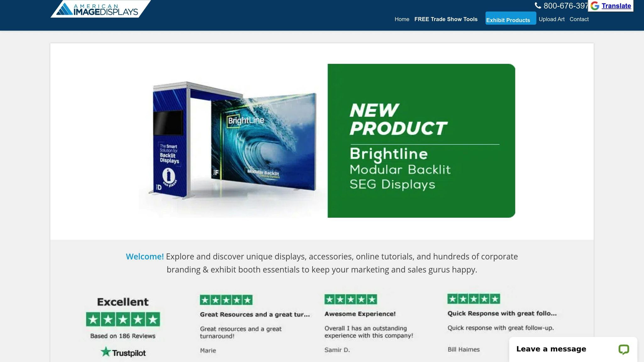
Effective booth layouts can leverage psychological principles to guide visitor behavior and boost engagement. American Image Displays provides a range of tools and display options designed to bring these strategies to life, helping you create an environment that naturally draws in your audience.
Modular and Backlit Display Options
Modular framed displays offer flexibility, allowing you to adjust and resize your booth for different events. Whether you need open spaces to encourage exploration or smaller, more focused areas, these displays can adapt to your needs.
Backlit displays, featuring energy-efficient LED panels, are perfect for spotlighting key messages with consistent illumination. They seamlessly integrate with your branding, lighting schemes, and multimedia elements, ensuring a cohesive and eye-catching presentation.
For example, a tech company at an expo used a modular display with an interactive LED wall that reacted to visitor movements, creating an immersive experience. Similarly, a health and wellness brand incorporated eco-friendly materials into their modular setup to highlight their commitment to sustainability while maintaining a polished, professional look.
Digital Display Stands for Dynamic Content
Static signage can feel outdated, but digital display stands offer a modern, attention-grabbing alternative. These screens deliver dynamic content that not only captures attention but also reshapes how visitors perceive your brand. Positioned above eye level or along booth edges, they enhance visibility and direct focus to your core messages.
Interactive digital displays, in particular, can increase engagement by as much as 70%. Pair bold LED visuals with concise, impactful messaging to make a lasting impression.
Free Design and Project Management Support
American Image Displays goes beyond just providing equipment – they also offer complimentary graphic design and project management services. Their team specializes in creating booth layouts that align with psychology-based design principles, ensuring your displays are tailored to your branding and interactive goals. From planning to logistics, they handle the details so you can concentrate on connecting with visitors and building relationships.
These solutions combine practical design expertise with psychological insights, helping you optimize visitor flow and engagement as part of your overall trade show strategy.
Key Points for Better Booth Design
Taking the psychological strategies discussed earlier, here’s how you can turn those ideas into a booth design that truly works. A well-designed booth acts as a silent salesperson, subtly guiding visitors through your space and influencing their decisions.
First impressions matter – and they happen fast. Visitors form opinions about your booth and brand in just seven seconds. This means your booth needs to look professional right away. Keep the layout clean and organized, place your branding at eye level, and make sure entry points are open and inviting.
Understanding how people naturally move through a space can give you a big edge. Research shows that visitors scan booths in Z-patterns or F-patterns. Use this to your advantage by placing your most important messaging where their eyes are likely to land first. Divide your booth into three zones: a visual hook to grab attention, an engagement area to interact with visitors, and a conversion space to close the deal.
Layout plays a crucial role in accessibility. Open layouts feel welcoming and encourage people to step inside, while closed layouts create an air of exclusivity. Whichever style you choose, ensure there’s enough room for people to move around comfortably. Position your team near the entrance – but not directly at it – to create natural opportunities for conversation.
Colors and lighting aren’t just decorative – they’re tools to guide attention and evoke emotions. Use contrasting flooring, archways, or focused lighting to subtly direct visitors deeper into your booth. Adding multi-sensory elements, like sound or touch, can make the experience more memorable. Together, these elements create a space that draws people in and keeps them engaged.
Your display solutions should align with these strategies. Modular displays are a great option because they’re flexible and can be adjusted for different events. Backlit displays with LED technology can make your messaging pop in crowded exhibit halls. For instance, a tech startup that used a curved backlit wall saw a 40% boost in booth visits. Booths with hands-on activities attract up to 50% more traffic, and companies that allocate over 15% of their budget to booth design report 32% higher satisfaction rates.
Quick design tips to keep in mind:
- Avoid overcrowding your booth, as it can discourage interaction.
- Create spaces that invite attendees to stay and explore.
- Showcase social proof by highlighting engaged visitors.
- Add gamification elements to make the experience fun and memorable.
FAQs
How can I use visitor movement patterns to improve my trade show booth layout?
Understanding how visitors navigate a trade show space can make a huge difference in how effective your booth is. By paying attention to typical traffic patterns, you can create a layout that naturally leads attendees to the areas you want them to explore – whether that’s your product displays, interactive features, or meeting zones.
Elements like well-placed signage, clear pathways, and eye-catching focal points can grab attention and invite people to engage. This kind of intentional design doesn’t just improve how traffic flows through your booth; it ensures that visitors interact with your most important features, leaving a stronger impression.
How can I use multi-sensory design elements to make my trade show booth more engaging?
Incorporating multi-sensory design elements into your booth can make a big difference in how visitors interact with your space. Start by focusing on sight – use bold colors, eye-catching motion graphics, LED displays, and well-placed lighting to naturally draw attention to key areas.
For sound, subtle background music or sound effects that match your brand’s vibe can create a welcoming atmosphere.
Engage the sense of touch by incorporating textured fabrics, interactive displays, or hands-on product demonstrations – these tactile elements invite curiosity and exploration.
Don’t forget smell – a carefully chosen scent, like the aroma of fresh coffee or a light floral fragrance, can leave a lasting impression that ties back to your brand.
By combining these sensory elements, you create an immersive experience that not only keeps visitors at your booth longer but also helps them form a stronger emotional connection with your brand.
How can I use color psychology to attract visitors and enhance my booth design?
Color psychology has a big impact on how visitors feel and behave, shaping the way they interact with your booth. For instance, warm colors like red and orange tend to spark urgency and energy, while cool colors like blue and green promote calmness and a sense of trust.
When designing your booth, think about how colors can support your goals. Bright shades like red can draw attention or inspire action, while softer tones like blue help create a friendly and dependable vibe. By tapping into the emotional effects of color, you can steer foot traffic, leave lasting impressions, and encourage meaningful connections with attendees.
