The FAQs About Trade Show Display Color Choices
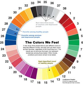
Part of making a great impression at a trade show comes from creating the right mood and emotion for attendees. The colors you choose for the graphics on your trade show displays will play a subtle role in delivering that message. The catch is, you won’t have the same goals at every event.
For different shows, you will undoubtedly have different goals and focuses. Different shows may mean different markets, and you may want to highlight different aspects of your business, changing or new products and exciting special offers. 
To help maximize the impact of your communications, you may want to evoke different subconscious feelings in your prospects for these different goals. You certainly don’t want to purchase new displays, or even table covers, every time you have a new goal. Instead, consider changing one of your display graphics or even just swapping out inexpensive table runners to change and control the colors of your message.
Here are some general guidelines to help you select the best colors for your table runners:
- Red can inspire passion and excitement but can also convey danger and fierceness. Try using red as a border or for lettering rather than making it the prominent color.
- Orange makes people feel a lively exuberance, which is great for product launches. However, like with red, don’t make it overwhelming because your display may then become too “loud” for some visitors.
- Yellow is a cheerful color that literally brightens peoples’ day. The drawback is, it can subliminally cause caution so don’t use it when promoting an idea that is highly ambitious or progressive.
- Green brings a feeling of cool, refreshing relaxation. It can be ideal when you want the attendees to feel comfortable rather than excite them with something groundbreaking.
- Blue is a tricky one. It can make visitor feel subdued but that can easily become unhappiness, which is never a good association.
- Purple, royalty and dignity go hand-in-hand. Being regal is great in 16th Century England, not always as great at 21st Century trade shows. Unless, of course, it has a direct connection to your business.
- White is pure, clean and well-organized but it should be the color of the cover, not the table runner.
- Black equals emptiness and negativity. Even if it looks sleek, that is a rough impression to overcome. (Yet, many trade shows use black carpeting and black drapes on the back walls!)
Clearly, there are practical considerations to take into account also – for example, white may match your message, but depending on the location, it gets dirty easily, turning into a mixed message.
The important takeaway is to be aware that your color choices have subconscious, psychological overtones that affect your booth staff and your clients.
Keep those subtle messages in mind while selecting the colors of your carpeting and displays, be comfortable with your selections, and also be aware there are low cost options such as table runners, banner stands, etc., that can be used to quickly swap colors and psychological messages as required.
